Crea con el Constructor de Aplicaciones Responsivas Más Fácil
Hemos revolucionado la construcción responsiva para ser verdaderamente arrastrar y soltar sin flexbox
El Constructor Más Flexible de Su Tipo

Lo Que Ves es Lo Que Obtienes
Coloca componentes en la pantalla exactamente donde los deseas, sin flexbox de por medio.

Diseño Personalizado para Todos los Tamaños de Pantalla
Sin adivinar cómo se verá tu aplicación cuando se publique. Obtén una vista previa de tu diseño hasta el píxel.

Crea Diseños de Múltiples Columnas
Ahora diseña diseños de múltiples columnas para computadoras de escritorio y tabletas como nunca antes.
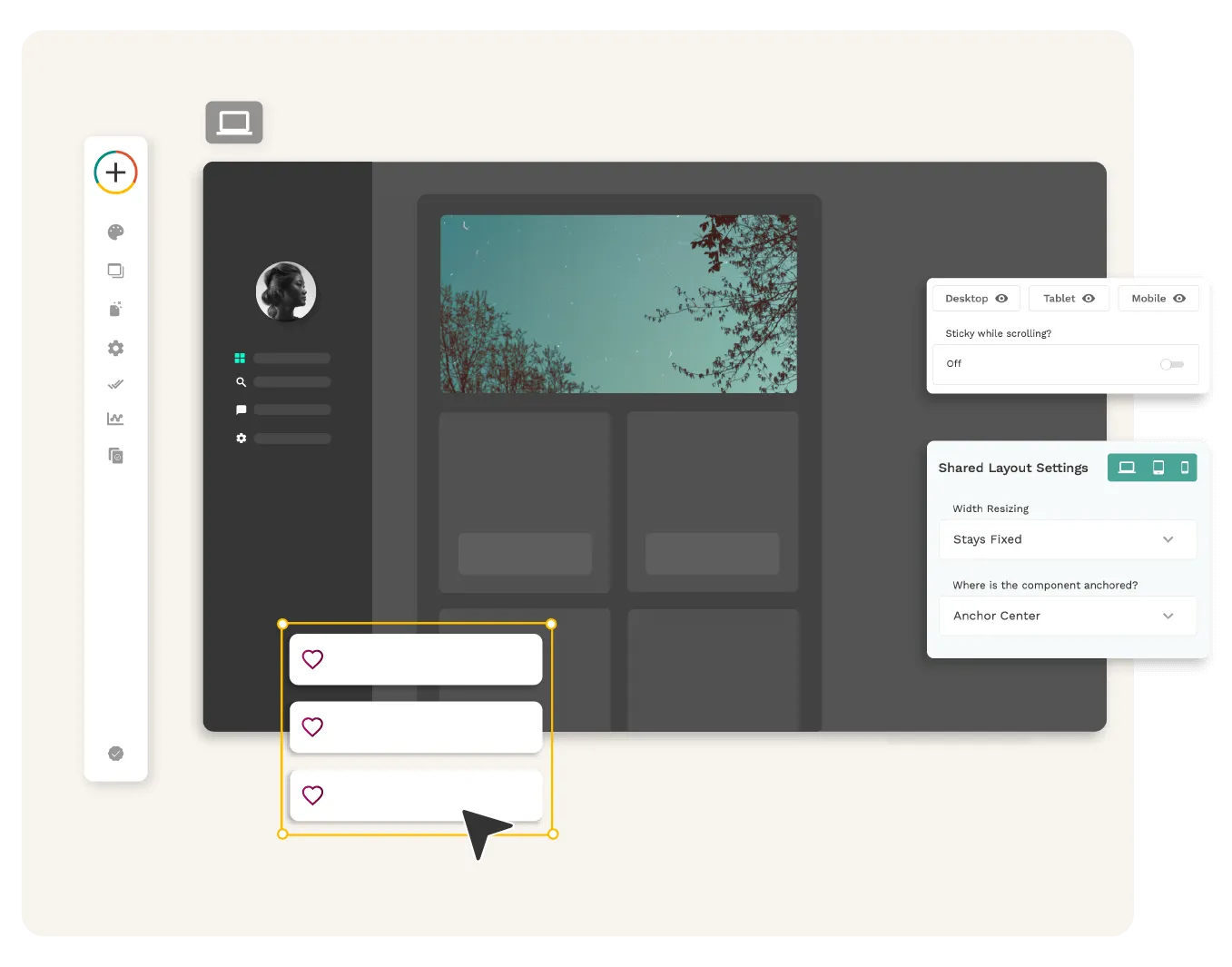
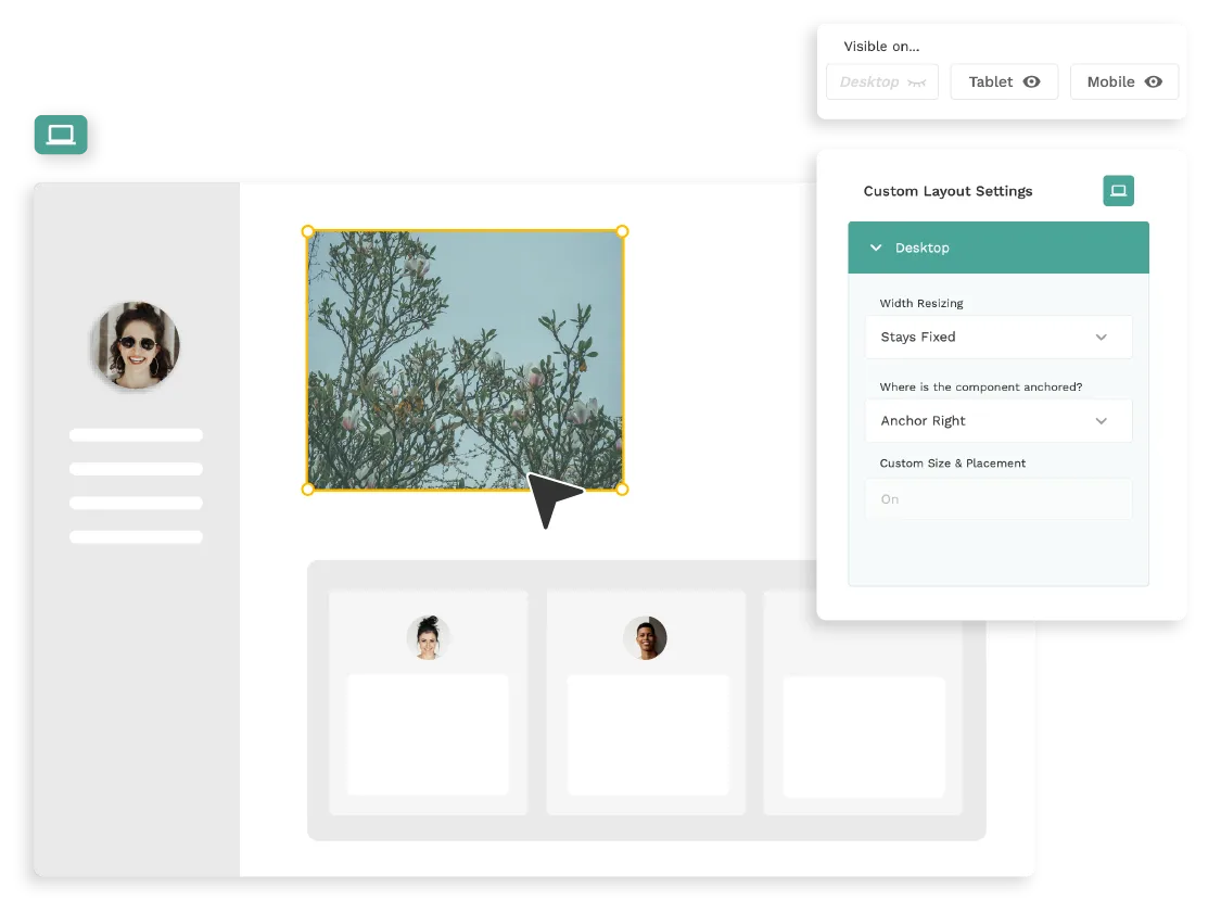
El Constructor Responsivo Freeform
Dentro del Constructor de Adalo 2.0, personaliza completamente cada punto de quiebre para visualizar exactamente cómo se verá en cada tipo de dispositivo justo ante tus ojos.
- No estás limitado a flexbox o un sistema de cuadrícula como otros constructores. Es verdaderamente freeform, y puedes reorganizar tus componentes según sea necesario para crear exactamente lo que envisionas. Aprovecha la flexibilidad para diseñar de la manera que desees.
- Adalo es la forma más fácil de crear una aplicación disponible en todas las plataformas, por no mencionar que es la ÚNICA.
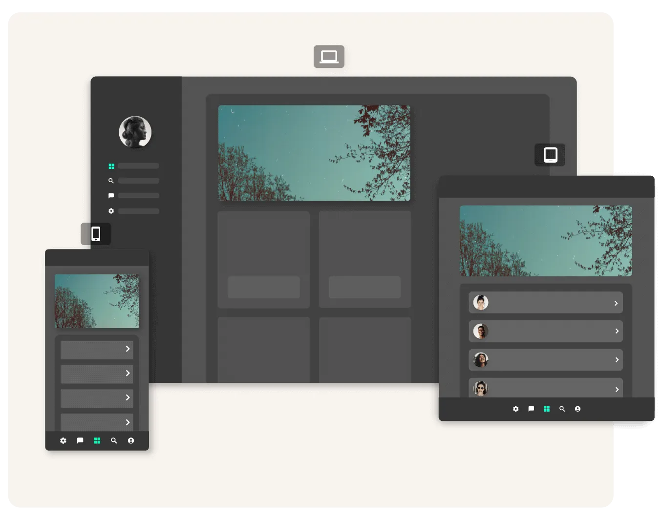
La Aplicación Responsiva Final
Ahora, con capacidades de diseño responsivo, puedes deleitar a tus clientes con aplicaciones hermosas que permiten la mejor experiencia en dispositivos móviles, tabletas y computadoras de escritorio.
- Sin más adivinanzas sobre cómo se verá la aplicación en cada tamaño de pantalla
- Sin más compromisos sobre dónde publicar
- Sin más conformarse con experiencias desconectadas
Adalo es la Mejor Manera de Crear Aplicaciones — Tanto Nativas como Web
Crea para Cada Tamaño de Pantalla
Ahorra tiempo y alcance del proyecto creando en todos los tamaños de pantalla simultáneamente
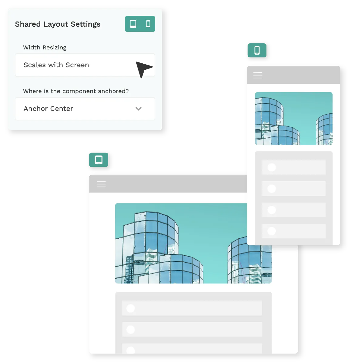
Establece Convenientemente Diseño Compartido
Perfecto para diseños que se verán similar en los tres puntos de quiebre
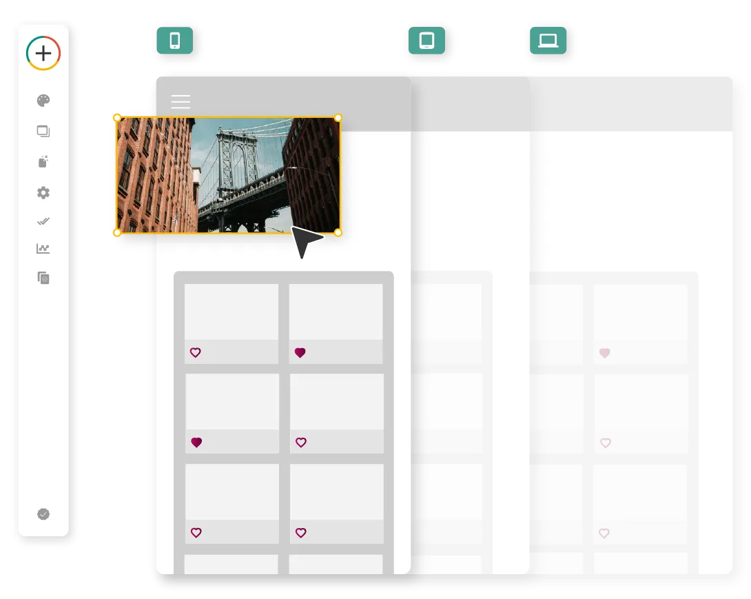
Selecciona Diseños Personalizados
Controla la visibilidad, estilos, espaciado y restricciones de cada componente
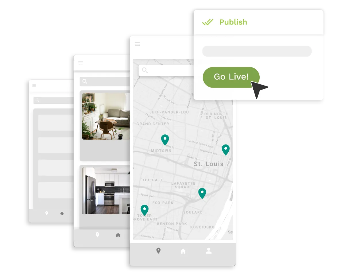
Visualiza el Producto Final Antes de Publicar
El constructor responde a cómo se comportará tu aplicación mientras arrastras el tamaño de pantalla
Preguntas frecuentes
¿Por qué necesitamos diseño responsivo?
El diseño responsivo es esencial para cualquier aplicación que desee proporcionar una excelente experiencia de usuario. Con tantos dispositivos y tamaños de pantalla diferentes disponibles, es importante asegurarse de que tu aplicación se vea y funcione de la mejor manera sin importar dónde se acceda. El diseño responsivo te permite crear una experiencia consistente y agradable para todos los usuarios, independientemente del dispositivo que utilicen.
Ya sea que tu aplicación se esté utilizando en una computadora de escritorio, tableta o dispositivo móvil, el diseño responsivo garantiza que se vea y funcione de la manera en que fue concebido. Elimina la necesidad de crear múltiples versiones de tu aplicación para diferentes tamaños de pantalla, lo que puede ahorrarte considerable tiempo y dinero.
¿Cómo funciona el constructor responsivo de Adalo?
El constructor responsivo de Adalo está diseñado para ser verdaderamente freeform, permitiéndote arrastrar y soltar componentes y organizarlos de cualquier manera que desees. A diferencia de otros constructores que pueden limitar tus opciones de diseño usando un sistema de cuadrícula o flexbox, Adalo te da la flexibilidad para crear un diseño que coincida con tu visión exacta.
Con el constructor responsivo de Adalo, puedes personalizar completamente cada punto de quiebre para visualizar exactamente cómo se verá tu aplicación en cada tipo de dispositivo. Esto significa que puedes ver exactamente cómo se verá tu aplicación en un dispositivo móvil, tableta o computadora de escritorio antes de publicarla. Adalo también es el único constructor que te permite crear una aplicación disponible en todas las plataformas, lo que la hace la forma más fácil de crear una aplicación multiplataforma.
Más Información
Comienza a construir tu aplicación hoy
No se requiere código. Gratis para empezar.
Crear gratis →